Branding Work
Perdue
Re-Imagining a 100-year old Brand
With over a century of history, Perdue’s legacy began as a humble egg business founded by Arthur Perdue. The company was later revolutionized by his son, Frank Perdue, who famously transformed chicken from a basic commodity into a trusted, household brand. Today, under the leadership of CEO Kevin McAdams, Chairman Jim Perdue, and fourth-generation family members Ryan and Chris, Perdue is stepping confidently into the future.
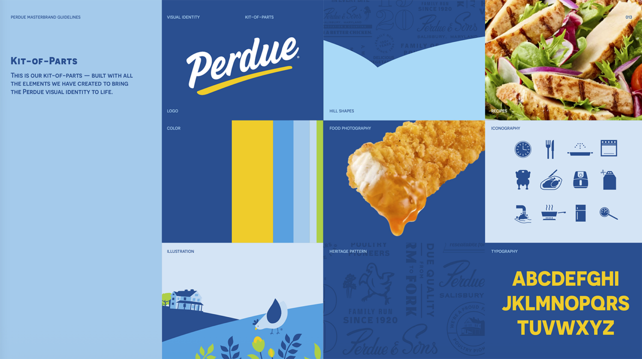
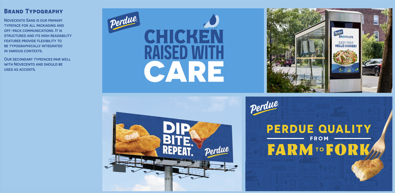
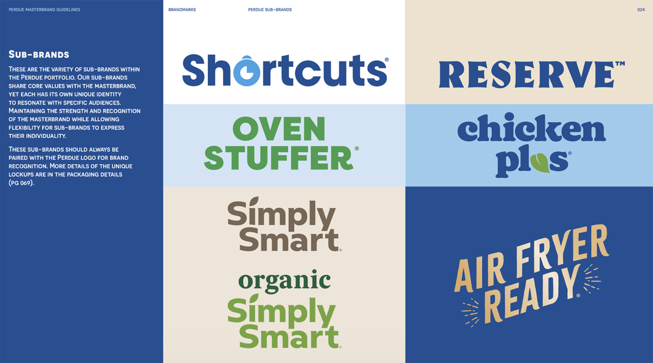
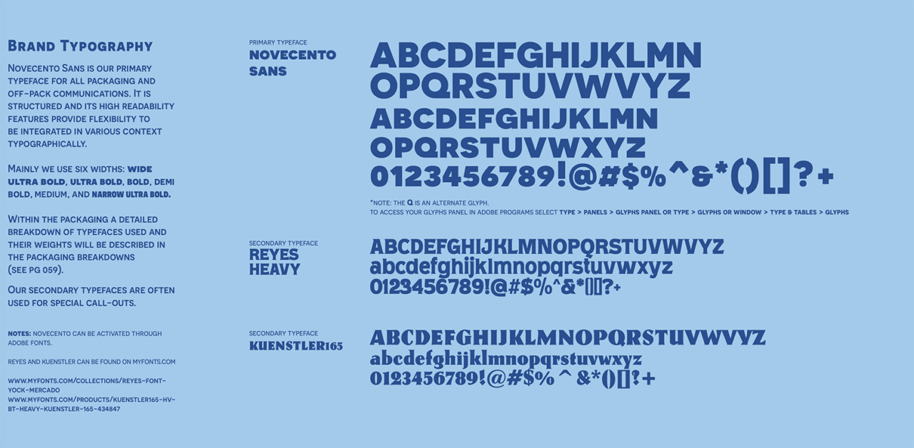
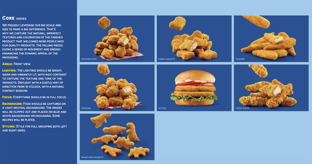
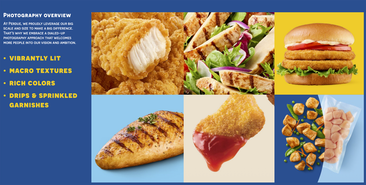
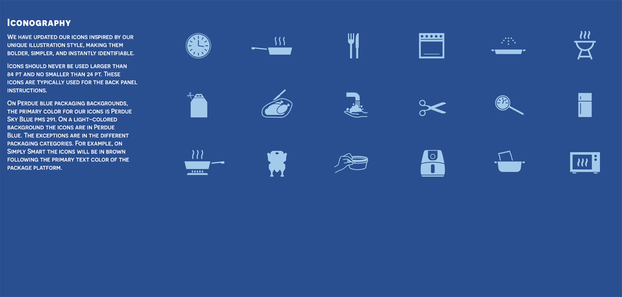
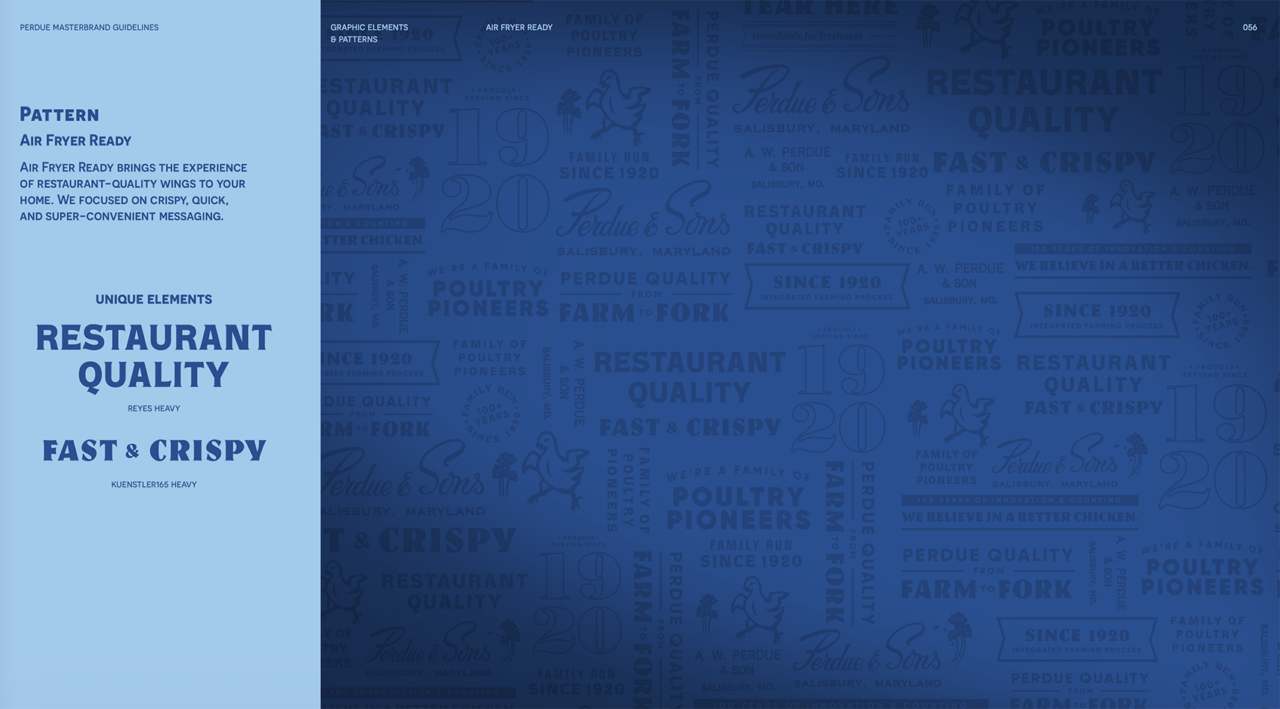
Our mission in updating Perdue’s entire brand identity—spanning the primary logo, sub-brands, iconography, typography, and core assets—was to preserve this rich heritage. Modern consumers, particularly Gen Z, demand radical transparency. This refresh visually reinforces Perdue’s commitment to remaining an authentic, family-owned-and-operated business from a consumer’s perspective.
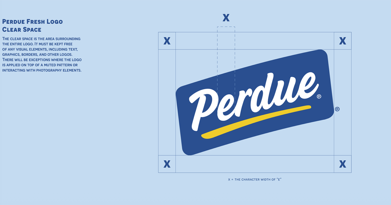
Below, you can view the previous visual identity alongside the refreshed design system introduced in late 2025.
Old Logo and Brand Guidelines
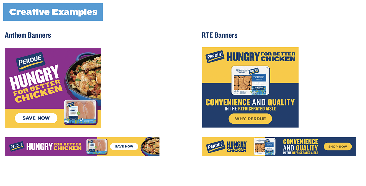
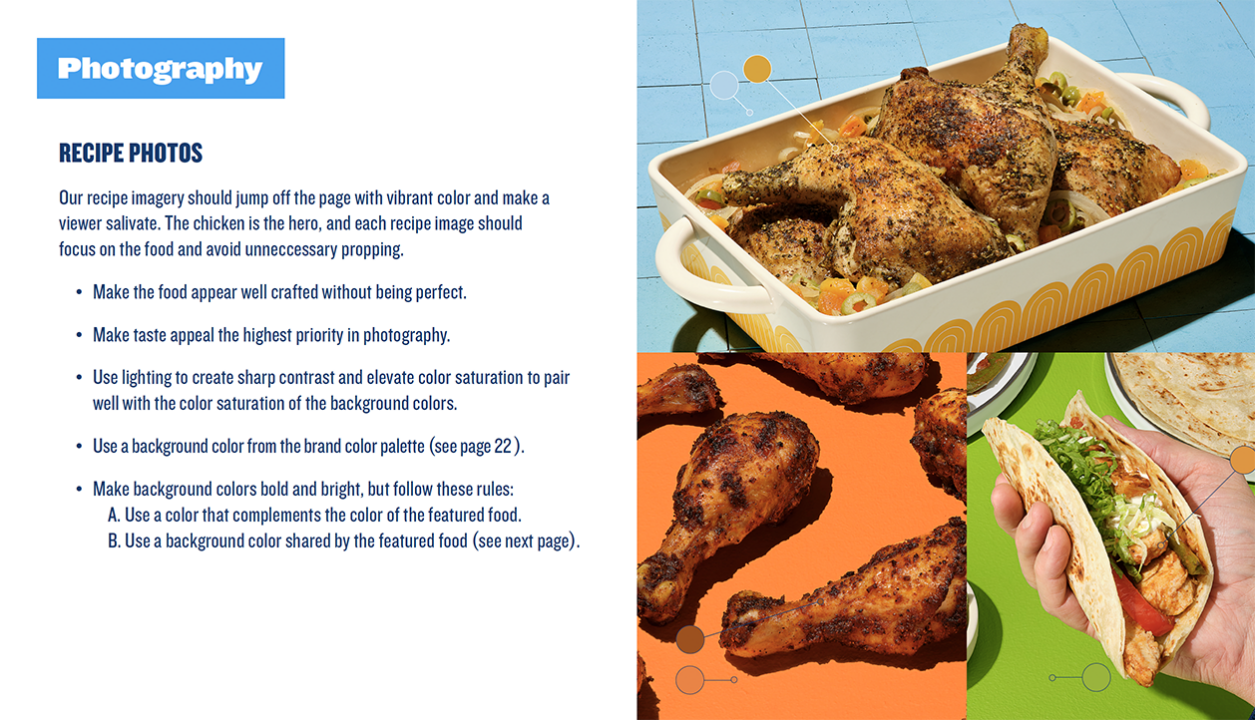
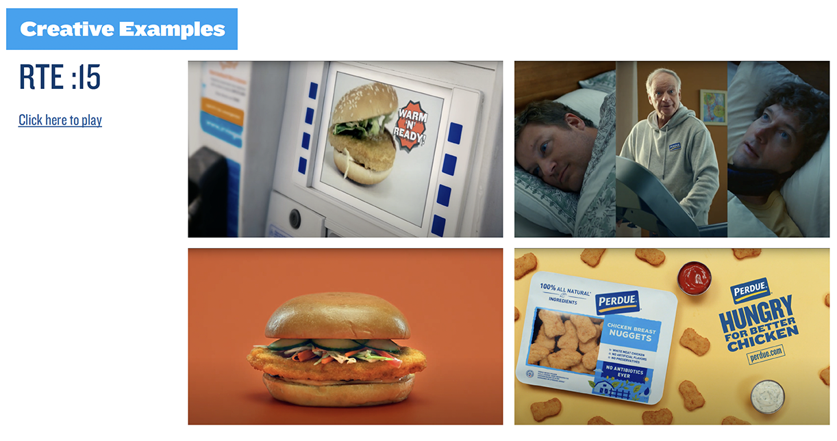
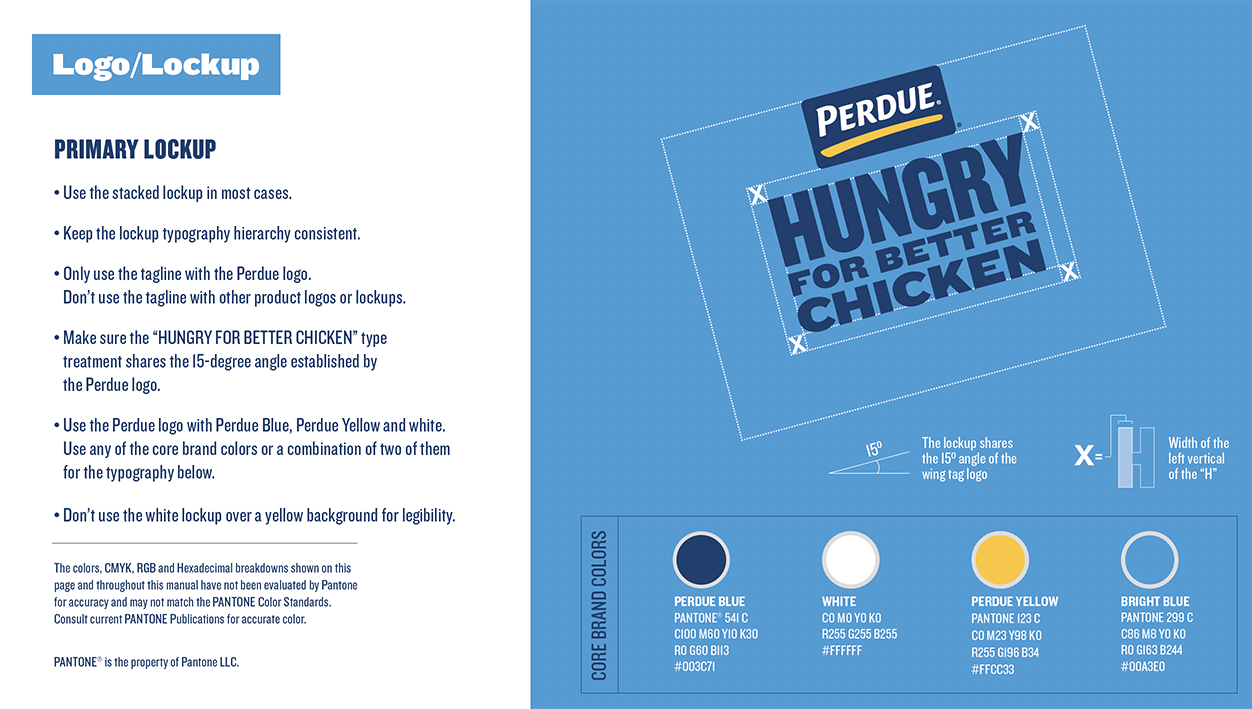
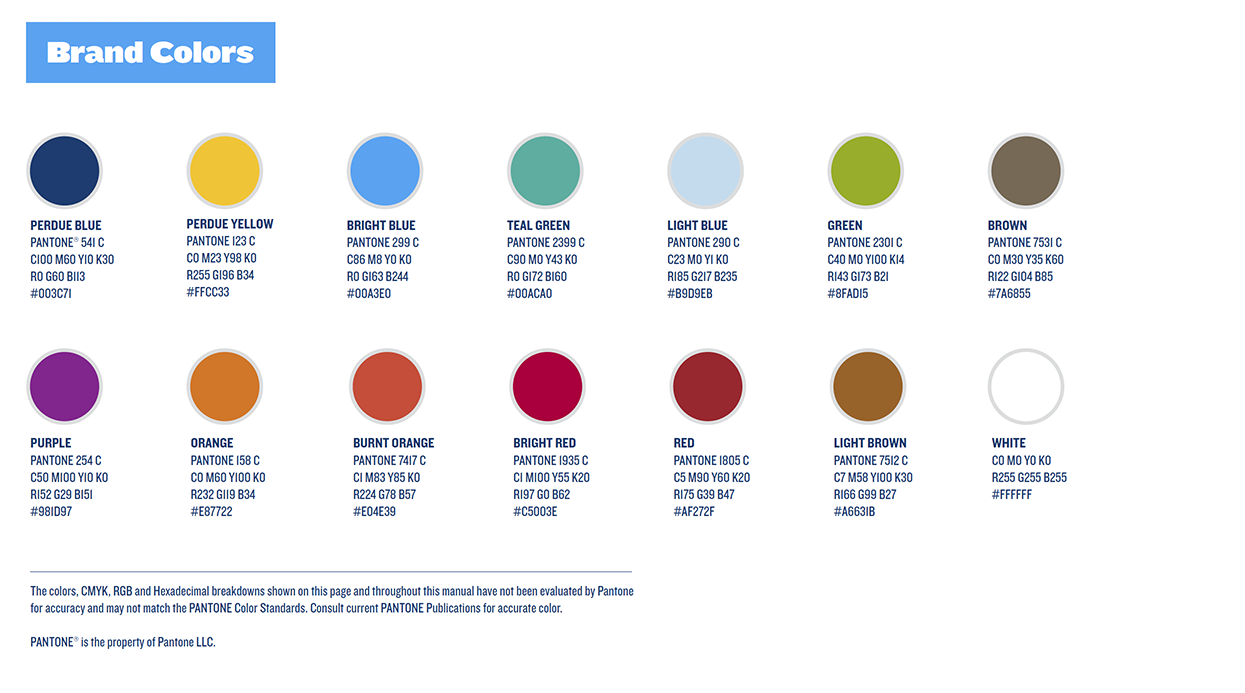
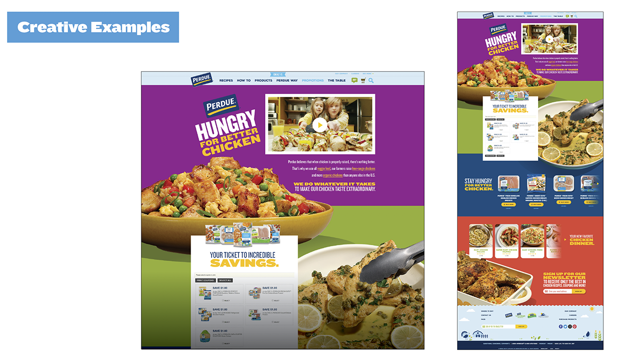
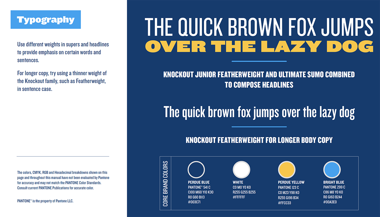
New Logo and Brand Guidelines
Flowers Foods
Rebranding of an Iconic Logo Marks
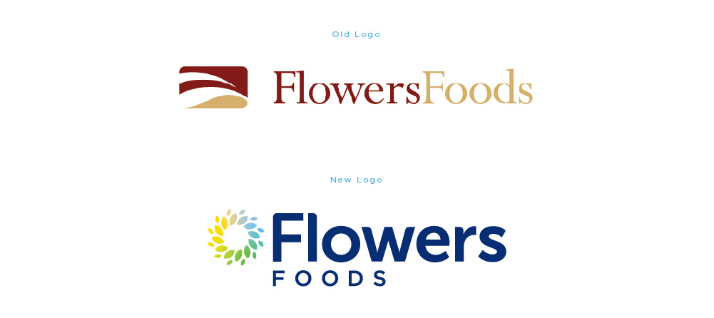
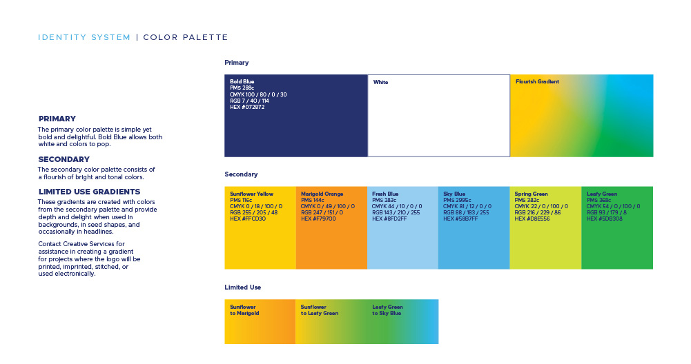
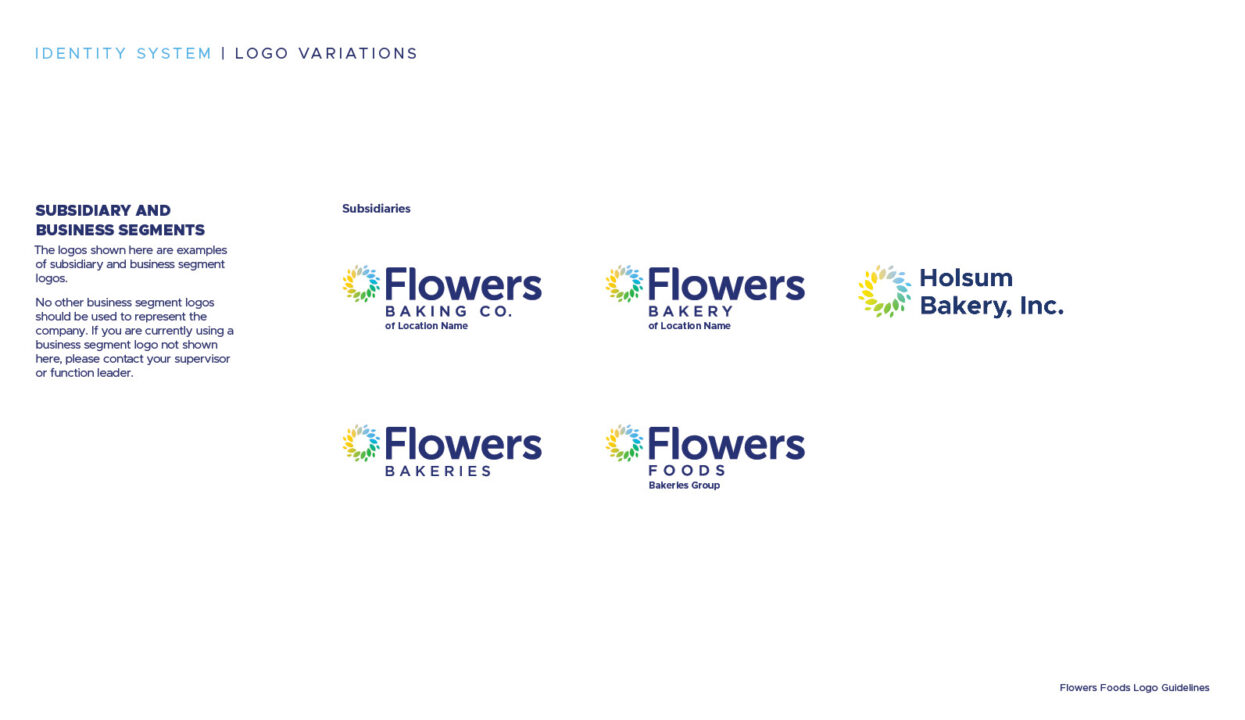
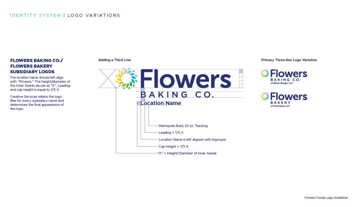
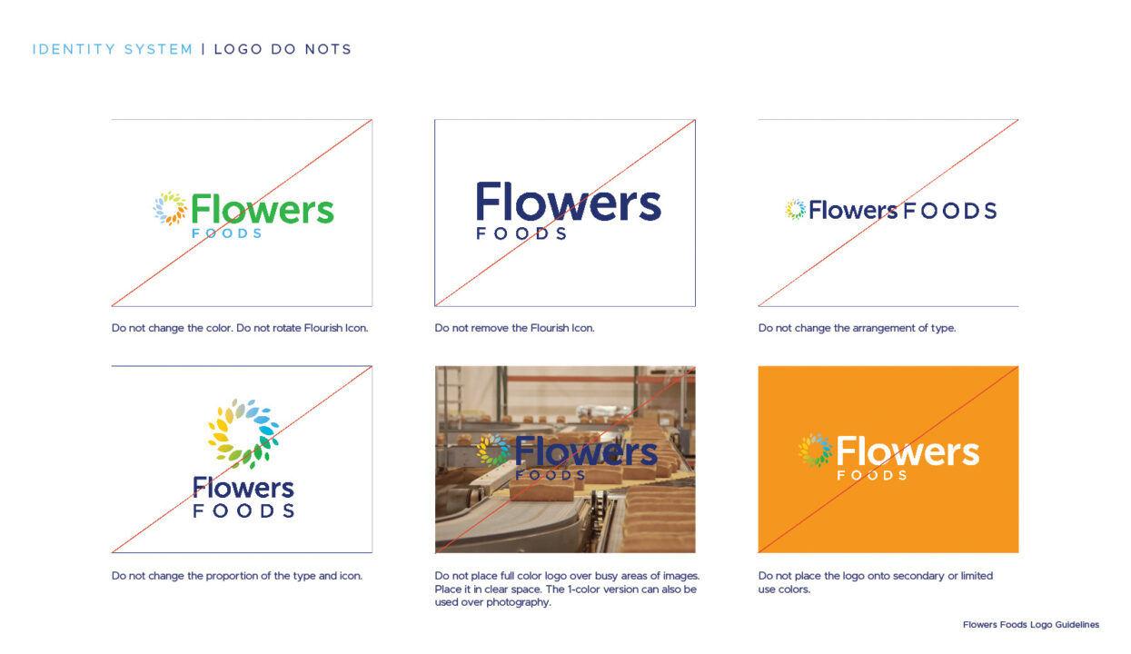
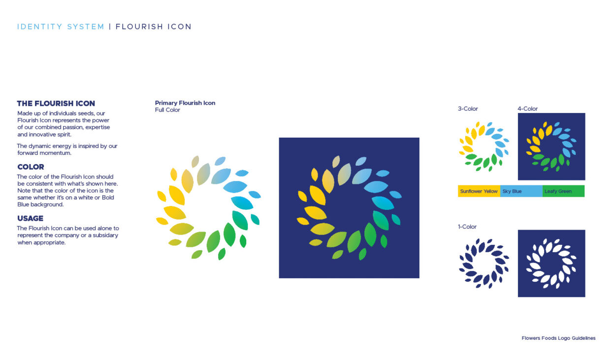
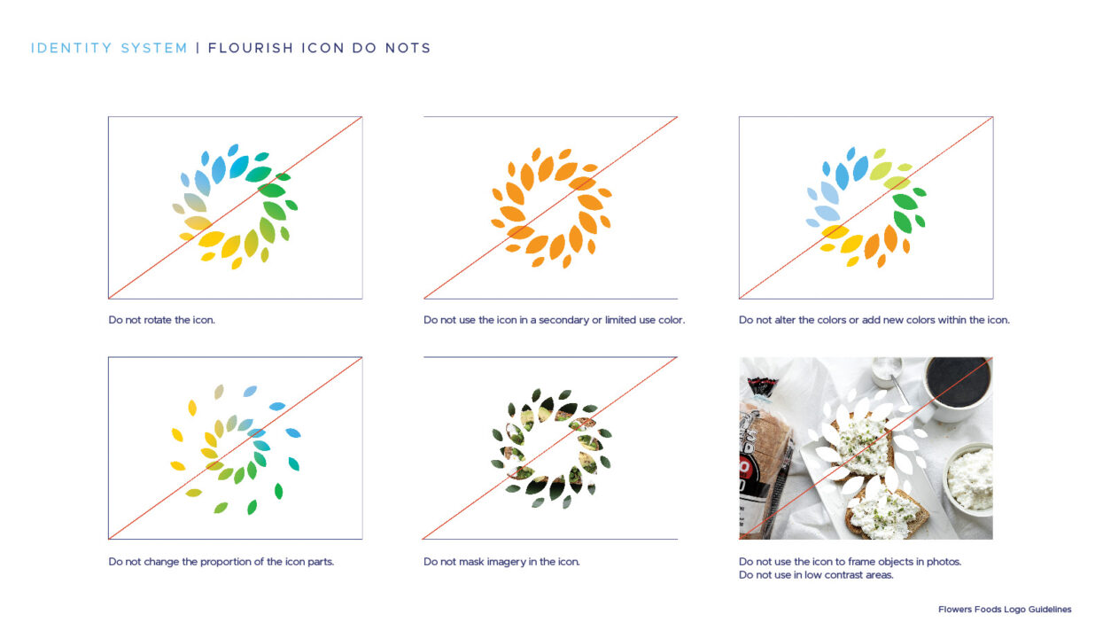
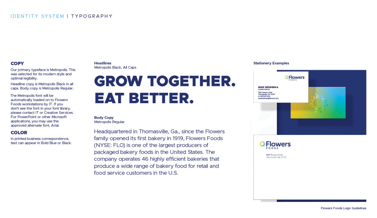
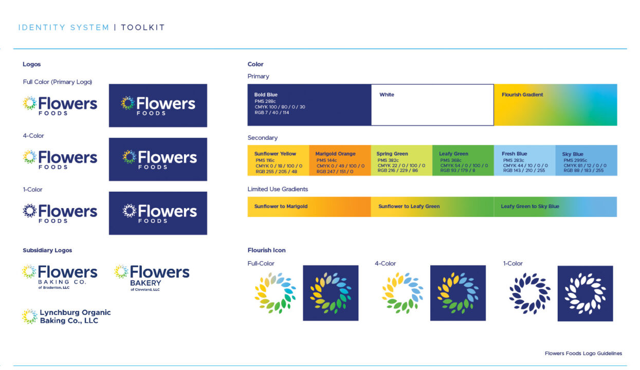
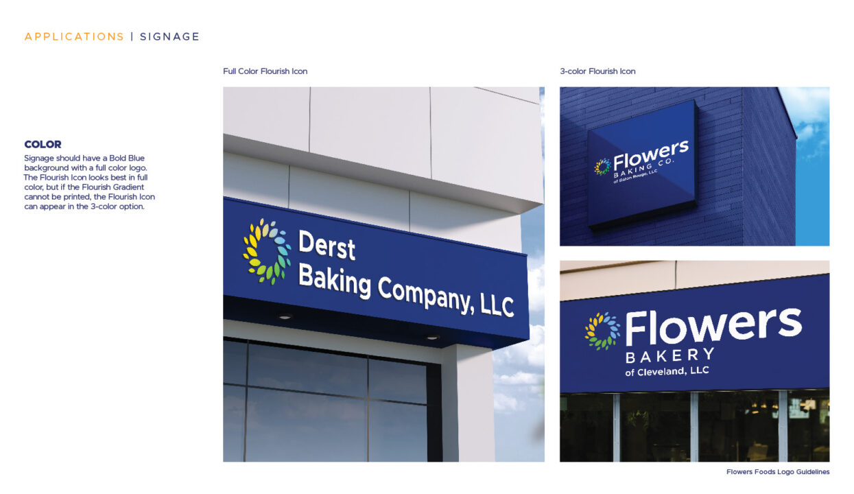
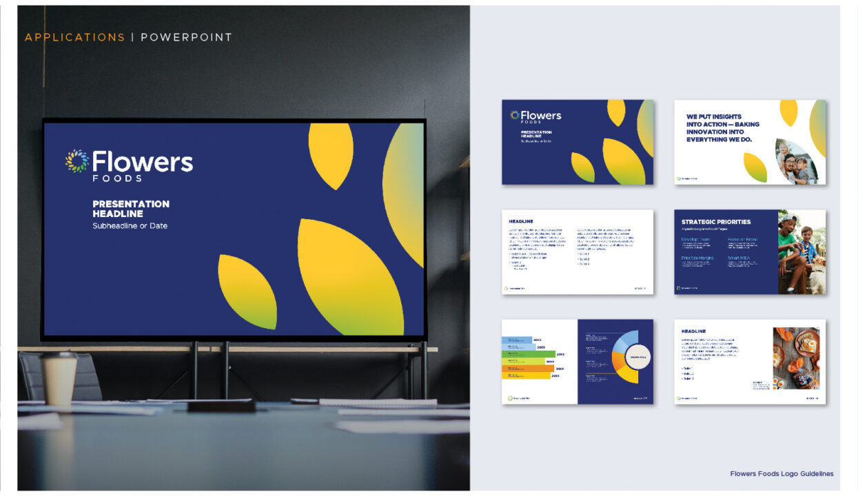
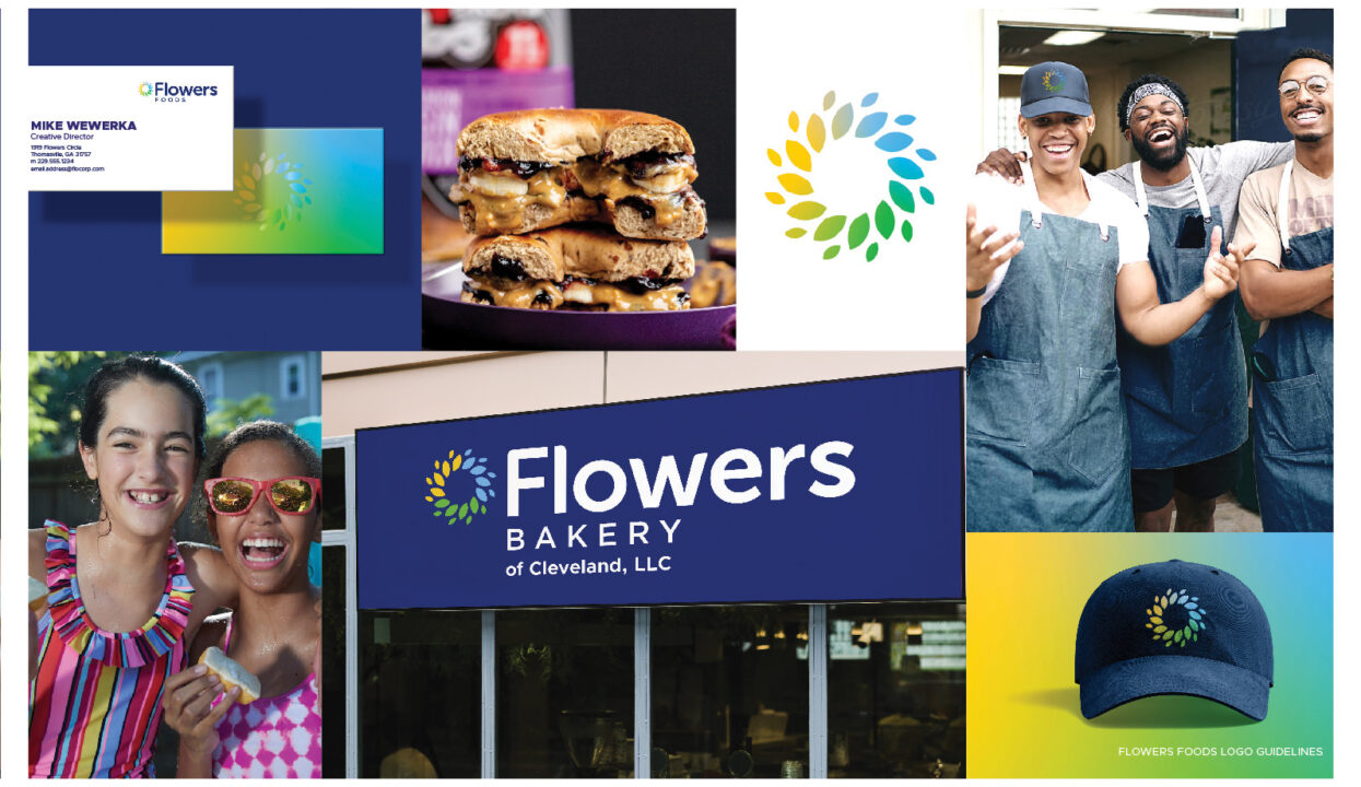
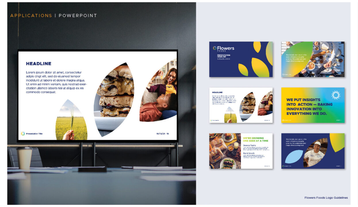
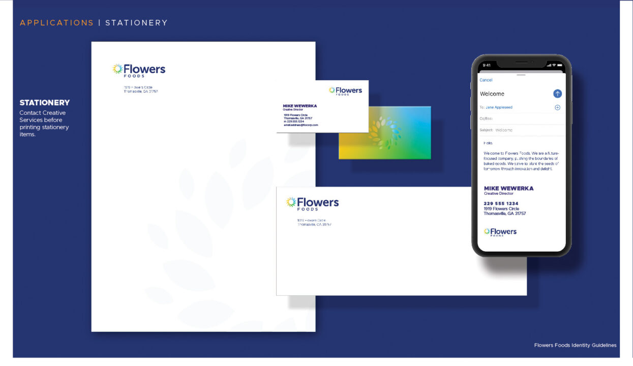
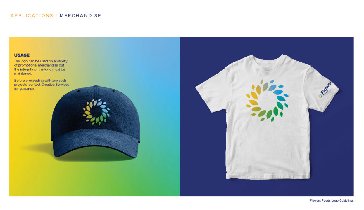
For Flowers Foods’ centennial anniversary, we undertook a complete brand modernization. Our team delivered a comprehensive corporate identity—including a redesigned logo, a clean sans-serif typography system, a vibrant new color palette, and updated brand guidelines for internal and external use. Beyond the visual assets, we defined the brand’s voice with a new mission statement and the tagline: “Fresh. Forward. Flowers.” To showcase the brand in action, we developed real-world mock-ups for signage and apparel, culminating in a high-energy launch video (featured below) that we shot and edited in-house.


Wonder Bread
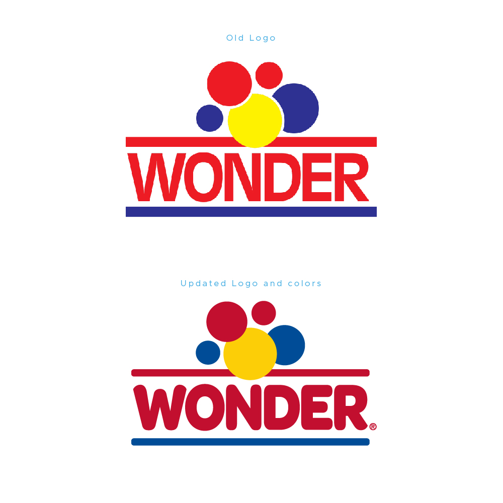
Following Flowers Foods’ acquisition of Wonder Bread from Hostess in 2013, updating this iconic American brand’s logo in 2018 served as my first major initiative for the company. Collaborating closely with my team, we developed a softer, more approachable visual identity featuring rounded edges and a refined color palette that moved away from harsh, “highlighter-like” tones in favor of softer primary colors. This strategic approach modernized the brand’s aesthetic while preserving Wonder’s instantly recognizable heritage, ensuring seamless continuity for loyal consumers.